
Visuals Add Value

“The soul never thinks without an image.”
When you are creating a presentation to a client or a workshop presentation - be sure to include some visuals to help make your message memorable and to increase your credibility.
More than 80% of what we learn is linked to what we see. Research, by the Wharton Applied Research Centre, sponsored by 3M, shows that when a presenter uses visuals, an audience remembers 10% more of the presented information. Also, visuals are processed 60,000 times faster than text. Research by the University of Minnesota reveals that presenters who use computer-generated visuals are 43% more persuasive than presenters who do not. Using clear and interesting visuals you will hold an audience’s interest more easily and you will be perceived as more professional and believable.
A picture can grab your audience’s attention and can often be more persuasive than words. It provides them with a peek at the real issues:

Some extra benefits of visuals:

Choose your medium
As a presenter you have many options for displaying your visuals, including: samples, posters, props, banners, multimedia productions, videos, slides, whiteboards, flip charts and many others. Consider which visuals suit your audience and message.
Use flip charts and markers for a small, informal audience, as they will encourage audience participation, while larger audiences benefit from slide visuals.
Here are some ideas for what to include on your slide visuals:
- Photographs
- Statistics
- Graphics
- Maps
- Shapes
- Cartoons
- Graphs
- Diagrams
- Lists
- Questions
General Guidelines

When using technology always assume that whatever can go wrong, no doubt will. Keep a contact phone number handy for someone who can fix the machine and always have a back-up plan. The backup plan for your laptop might be to have your presentation on a USB or handouts of your visuals.
Here are some important points about using visuals effectively:
- Make every visual relevant to the objective of your presentation.
- Colour is more memorable, more dramatic and fun.
- Keep fonts simple, large and clear and do not use more than two types. Avoid shaded or shadow fonts because they are hard to read.
- The visual standard is one message for each visual, six words per line and six lines per visual.
- Write titles as if they were front-page headlines. Tell your message in a brief and interesting way.
Visuals are great in the opening, content and closing phases of your presentation.
Using Diagrams
Sometimes organising content physically works best, either by geography or by a diagram. For example, if you were discussing the world market for a product, you could discuss the prospects by regions, such as Asia Pacific, The Americas, Europe, Russia, Africa and the Middle East. Or if discussing a new factory design you might show a drawing of the factory, and then discuss one area at a time. If at the start of each new section, you show the drawing highlighting the next area, the drawing can act as a signpost.
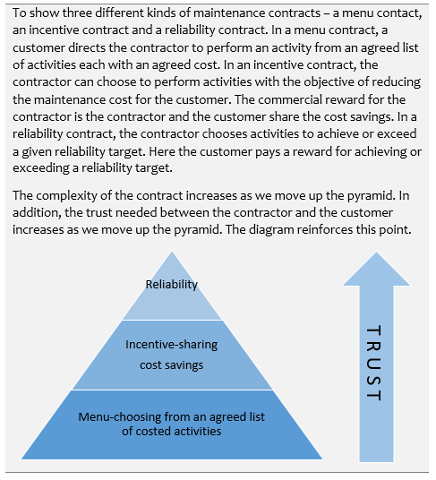
Here, we have used a pyramid diagram.
Another diagram that is frequently used is the 2x2 matrix.

If you wish to illustrate a process or flow of activities, then a McKinsey value chain is useful.

If you use a diagram, remember the principle of keeping your number of main points to seven or less. A complicated diagram can reduce the effectiveness of your persuasion. To increase the effectiveness of your communications, explore the many ways that you can use visuals within your presentations to make you more persuasive.