
Use Visuals for Concepts and Numbers

“Example is not the main thing in influencing others. It is the only thing.”
One of the world's experts on this topic is Gene Zelazny, Director of Visual Communications for McKinsey and Company. Just pause for a minute and consider that one of the world's top management consultancies pays someone to be the Director of Visual Communications. McKinsey specialised in fact-based analysis, so why pay attention to visual communication? Because, it takes more than logic to persuade an audience to act. The audience must understand, agree and remember. Visuals help people process the message faster and are more persuasive than words.
Gene Zelazny has more than 40 years' experience designing powerful management reports and presentations. His book, Say it with Chart: the executives's guide to visual communication is now in its fourth edition. We recommend you purchase a copy of Zelazny's book for your library, once you are familiar with the foundations of visual communication and have experienced how a well-designed visual can help you persuade.
There are two kinds of visuals, one for ideas and one for numbers. Visuals for ideas seem to be the least understood, so let's begin there with an example from outside business.
Visuals for Ideas
Results Australia is an organisation of volunteers who lobby governments to increase aid for poor people around the world (www.results.org.au). The importance of overseas aid is often difficult to understand and communicate. Most of the information comes from government organisations and the writing style is 'heavy'. Read the following text and rate it on a scale of 1 to 10 where:
1 = you do not understand the material and do not understand what the problem is
10 = you understand the material and the problem

Your rating out of 10:
Now compare those thoughts and look at the following diagrams:

Your rating out of 10:
When most people read the text, their eyes glaze over because there are so many terms and numbers. In contrast, the diagrams highlight the two issues clearly and quickly.
When we see a gap between where something is and where is should be, our brain asks two questions, "How can we close the gap and why should we close the gap?" Your job, Persuading for Results, is to raise awareness of gaps and recommend ways of closing them. Visuals are very powerful tools for this task.
Gene Zelazny devotes a section of his book to presenting ideas, and looks at how to shoe interaction, leverage, obstacles, structure, sequence and process. Here are some examples:

A good tool for creating these diagrams is Microsoft Visio. However they can all be created in word with a bit of patience, and whilst Visio has a good selection of ready-made diagrams it is difficult to change if not everyone on your team has the software.
Visuals for Numbers
Let's move on to look at charts for numbers, and begin with an example. Many people will create their charts from Microsoft packages. Let us assume we are trying to decide whether to increase capacity to produce a product. So, we create a chart showing the trend in unit sales from 1995-2010. This is how it might appear from a Microsoft package.
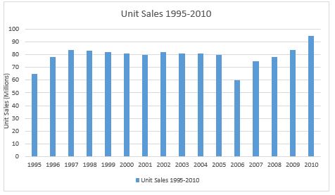
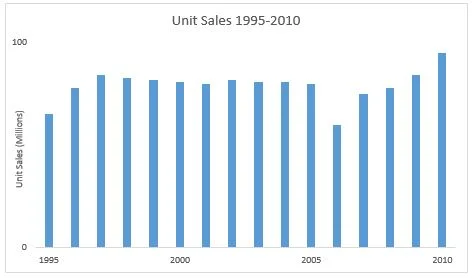
Our first question is what is the message of the chart? Is the message that sales have averaged approximately 80 million units? Or, is the message that there was a dip in sales in 2006 and sales are now growing? There are several conclusions that can be drawn from the chart meaning that the presenter will have difficulty guiding the audience's interpretation. Instead, we need to decide what the message is, but first let's simplify the existing chart. We delete 'chart junk' by simplifying the axes by reducing the number of labels, deleting gridlines, borders and fills. This produces a clearer chart.
Now, let's assume we want to look at the long-term average to see what might be the right production capacity. The message we want to show is that the long-term average sales are 81 million. Two ways to present the chart are:


Notice how the message is in the title to ensure the reader gets the intended message. Also, notice the colour has been removed from the bars to increase the focus on the average. The chart now delivers the message clearly. However, because we have made the chart clearer, some of the audience might ask "is there a trend showing increasing sales and therefore does the business need extra capacity above the 81 million units?" In anticipation of this question we have prepared another slide.

Notice, how we put the new message in the title and also add an arrow for emphasis. The golden rule is only one message for each visual. Some presenters argue that one slide with several messages is acceptable. However it takes longer to present several messages in one slide than to explain each one with a separate slide. Also, the audience has to work harder to understand a slide with more than one message. The easier we make it for the audience to understand and remember the message, the more likely they are to be persuaded to act.
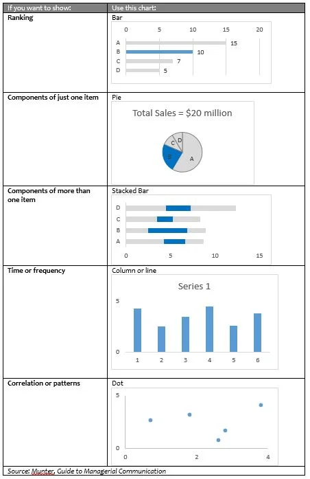
Next, we need to consider how to choose the right chart. This following table is adapted from Mary Munter, who summarises the work of Gene Zelazny in her excellent Guide to Managerial Communication which is now in its eighth edition.
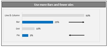
The final message comes from the experience of Gene Zelazny. How often should we use particular charts? He suggests that we need to use more bar charts and fewer pie charts. In many business situations, we examine market share, however we are really interested in how big our share is compared to our competitors. In other words we want to know how we rank compared to our competition. So, many of the pie charts we use would be more effective as bar charts. The chart below shows how often people use each kind of chart.
Numbers and complex ideas are some of the most difficult things to use to persuade, however using visuals can greatly increase your effectiveness. As the use of big data in your presentations increases, improving these skills will make you stand out from your competition.